Architectural Problem Solving
By Lisa October 27th, 2013
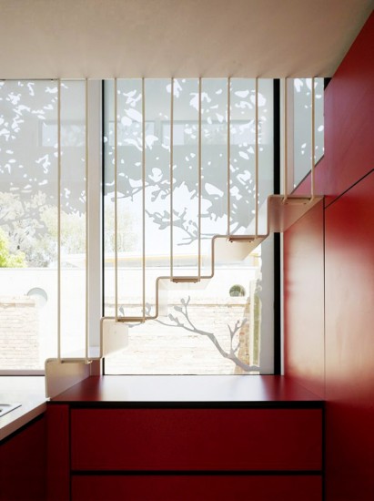
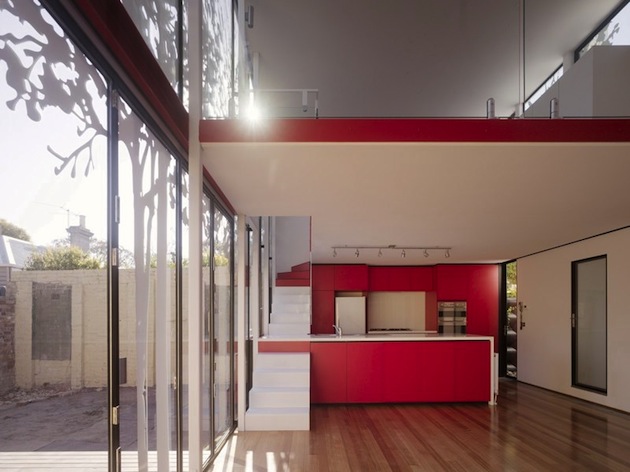
Most of us add on to our homes when we need more space and don’t want to move. And of course most of us are on a budget. It’s a designer’s job to help identify how much additional space is needed and how to lay it out most economically, staying within a client’s budget and at the same time staying within city codes and ordinances. The following photos of the “Tattoo House” in Australia show some of the most creative solutions I’ve seen. Costs are controlled by keeping the shape of the addition as simple as possible – a box. Codes requiring 75% opacity to second story spaces are met by applying UV-stable stickers to the massive glass walls. These stickers also reflect heat and glare away from the interiors eliminating the need for expensive curtains or shades. The tree graphic was made from photos taken in a local park and create interesting shadows in the interior that change all day.
Tight spaces call for multi-purpose built-ins. The most creative one here is the kitchen counter that doubles as part of the stairway. I can see some problems with this but the family, with 2 children, love its efficiency. The glass walls that form the open backyard corner fold back to create a true indoor/outdoor space and make the additional space seem much larger. While certainly not for everyone, it is great to see ingenuity at work!


