Color Schemes, Color Wheel
By Lisa August 19th, 2013
Using the Color Wheel
I had a great color consultation this week with clients that have recently moved into a new home. As the boxes begin to disappear and the existing walls and carpets emerge again, it’s time to make the space their own. Our conversation centered on how the rooms should feel and how to tone down colors in carpeting that they don’t like. This is a great time to pull out the color wheel!
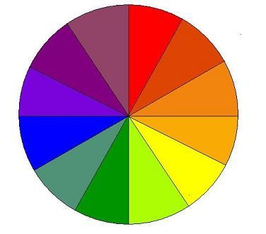
Many of us remember learning about the color wheel in elementary school. The wheel begins with the three primary colors; red, blue and yellow. Secondary colors are formed by mixing any two of these together in equal portions resulting in green, orange and purple. The wheel is filled in with colors created by mixing a primary color with its neighboring secondary color leading to yellow-green, yellow-orange, red-orange, red-purple, blue-purple and blue-green. There are neutral colors not on the color wheel that include white, black and gray. Tints of colors can be created by adding white to a color; shades are created by adding black.
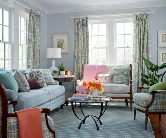
How does this help “set the mood?” By understanding what different color schemes mean and the results they produce. A monochromatic scheme is probably the safest and easiest to work with. It is created by using different shades and tints of one color. The scheme is easy to look at and establishes a soothing, balanced feeling.
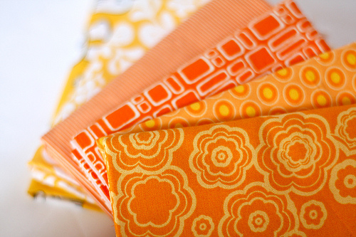
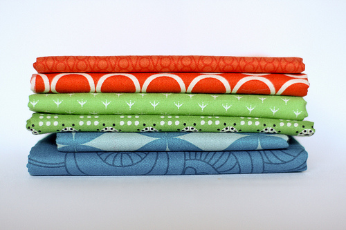
A step up in excitement from monochromatic is analogous. Here we use colors that are next to each other on the color wheel. This scheme is similar to monochromatic to work with and also results in a balanced atmosphere. Try not to use too many colors or to combine warm (think yellow) and cool (think blue) colors when working with this scheme.
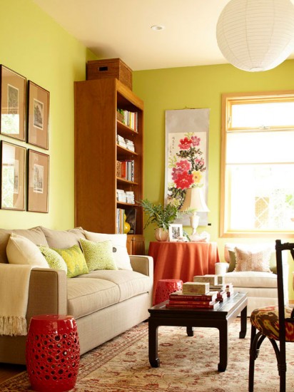
Colors that are across from each on the wheel are complementary colors. These colors play off each other and create a dynamic feeling. This can be a bold, vibrant effect so it’s best not used in large doses. An overwhelming feeling can be avoided by using one dominant color and subtle hints of the other. Derivatives of this scheme are split complementary (using a color and the two neighbors of its complement) and a triadic (three colors equally spaced around the wheel). These schemes can offer the contrast and vibrancy of a complementary scheme but in a more subtle way.
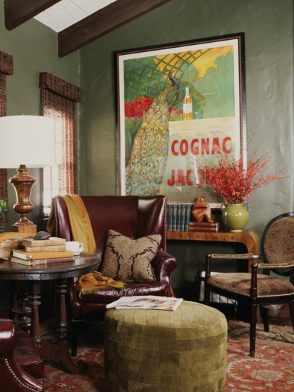
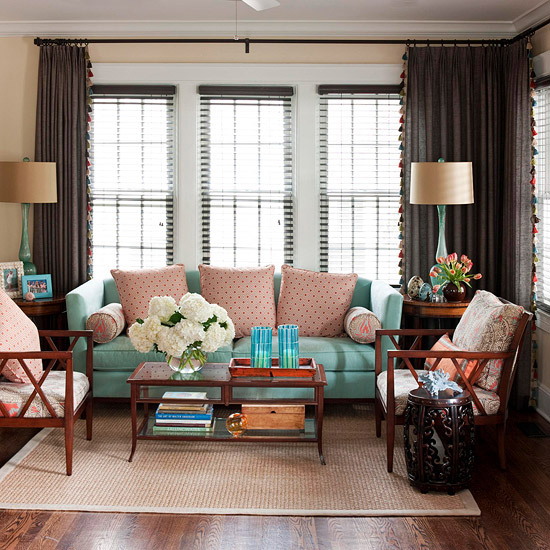
This is a split complementary:
The 2014 color predictions are coming out. Use these tips to combine the forecasted colors to work best for you!

